
Cards widget
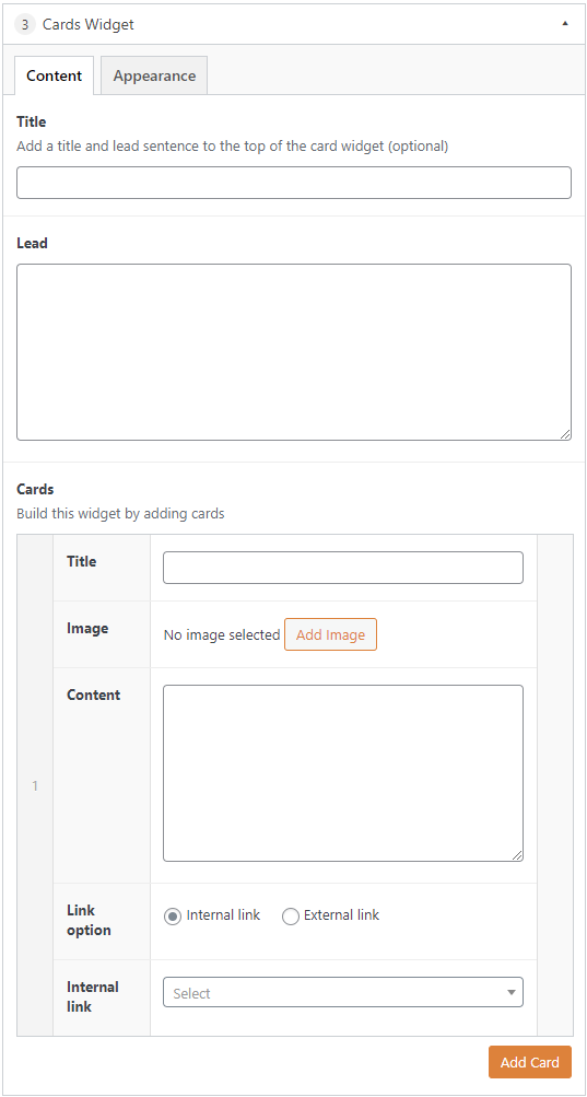
The cards widget is used to provide a visual CTA (call-to-action) linking to content on the site, with optional short text descriptions and an image. It is ideally used to provide secondary navigation to pages within a section of the site. The cards can be preceded by a heading and short paragraph of text. Each card consists of an image, title, short text and a URL.
Under the "Appearance" tab you can have the cards displayed in a column view. The column layout is automatically selected for the number of cards you have to give the best visual experience. Any more than 5 cards and they will display in a 3 column layout to maximise page space.
Stacked cards
Gallery widget
Working with images
Did you know?
Column cards
The column layout is automatically selected for the number of cards you have to give the best visual experience. Any more than 5 cards and they will display in a 3 column layout to maximise page space.
One card
Displayed as a large card in a single full-width column.
The content editor
Two cards
Displayed in 2 even columns.
The content editor
Featured content
Three cards
Displayed in 3 even columns.
The content editor
Featured content
User guide
Four cards
Displayed in 2 rows of 2 even columns.
The content editor
Featured content
User guide
Gallery widget
Five cards
Displayed as 1 row of 2 columns, and 1 row of three columns.
The content editor
Featured content
User guide
Gallery widget
Working with images
Six or more cards
Displayed in 3 columns